
 Brijesh Desai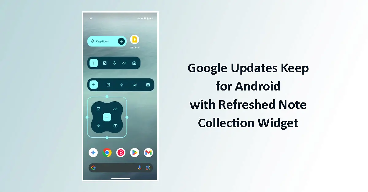
Google updates Keep for Android with refreshed note collection widget, replacing the Material You sidebar with a circular FAB and adopting edge‑to‑edge design in version 5.26.365.x.
Google updates Keep for Android with refreshed note collection widget
Google updates Keep for Android with refreshed note collection widget, rolling out a small but noticeable redesign in version 5.26.365.x of the app. The change affects the “Note collection” widget that shows a feed of selected notes on the Android home screen, making it more compact and visually consistent with other Keep widgets.
The update is part of a gradual refresh of Keep’s home-screen experience, following earlier additions such as the “Quick capture” widget and improved label-based collections. It is now reaching users via the Google Play Store on Android devices.
What changed in the Note collection widget
The refreshed Note collection widget keeps the same core function—displaying a scrollable feed of notes from a chosen label or set—but tweaks the layout and controls:
- Material You sidebar removed: The right-hand sidebar with shortcuts to quickly add a text note, list, audio note, drawing, or photo has been removed.
- Circular floating action button (FAB): A new circular FAB, similar to the one on the “Single note” widget, now sits in the corner. Tapping it opens a pop-up menu with the same creation options that were previously in the sidebar.
- Two-tap note creation: Instead of one tap on a sidebar icon, users now tap the FAB, then choose the note type from the pop-up, matching the behaviour of the smaller “Quick capture” widget.
These changes streamline the widget’s appearance and reduce visual clutter, at the cost of adding one extra tap to create a new note from the widget.
Edge-to-edge design and layout improvements
Alongside the control changes, Google has adjusted the widget’s layout:
- Edge-to-edge design: The widget now uses the full width of the chosen widget size, removing the previous padding and empty space on the sides.
- More content visible: Because the sidebar is gone and margins are reduced, each note in the feed can display slightly more text and detail.
- Cleaner full-width look: On large, full-width widget layouts, the older design left considerable blank space; the new version fills that area with note content.
For users who rely on Keep widgets as a glanceable “inbox” or dashboard, this means more information is visible at a glance without opening the app.
How to use the updated widget
If you already have a Note collection widget on your home screen, it should update automatically as the new version of Google Keep rolls out. To add or refresh one:
- Long‑press on an empty area of your Android home screen.
- Tap Widgets.
- Find Keep in the list.
- Choose Note collection (or “Note collection (new)” if both appear during rollout).
- Drag it to your home screen and select the label or set of notes you want to display.
- Use the new circular FAB to create notes directly from the widget.
The widget continues to support different sizes, from small squares to large rectangles, allowing you to prioritise either compactness or content density.
Rollout status
The refreshed Note collection widget is part of Google Keep version 5.26.365.x for Android, which is rolling out via the Play Store. As with most Google updates, it may take a few days to reach all devices and regions. Some users may still see the older design until their app updates.
There is no equivalent update announced for iOS at this time; the change currently applies only to Android.
Summary: Google updates Keep for Android with refreshed note collection widget, replacing the Material You sidebar with a circular FAB, adopting edge‑to‑edge design, and showing more of each note in the feed. The change is live in Keep version 5.26.365.x on Android via the Play Store.